Unicornfest: Building an award winning brand for Leukaemia Care
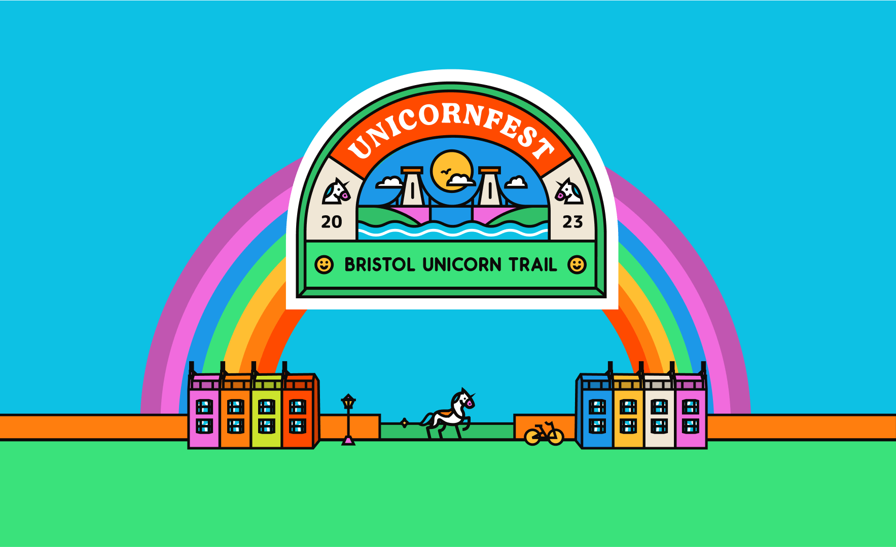
Unicornfest is a charity art trail of life-sized painted unicorns around the streets of Bristol and the Southwest, running through the summer of 2023. As the sun shines bright, this delightful event aims to bring together art enthusiasts, community members, and supporters of a brilliant cause – all for the benefit of Leukaemia Care.
In 2022, Leukaemia Care approached Rocketmakers with a vision, seeking to turn their idea into a reality. With our expertise, we helped the Unicornfest team bring their creative concept to life.
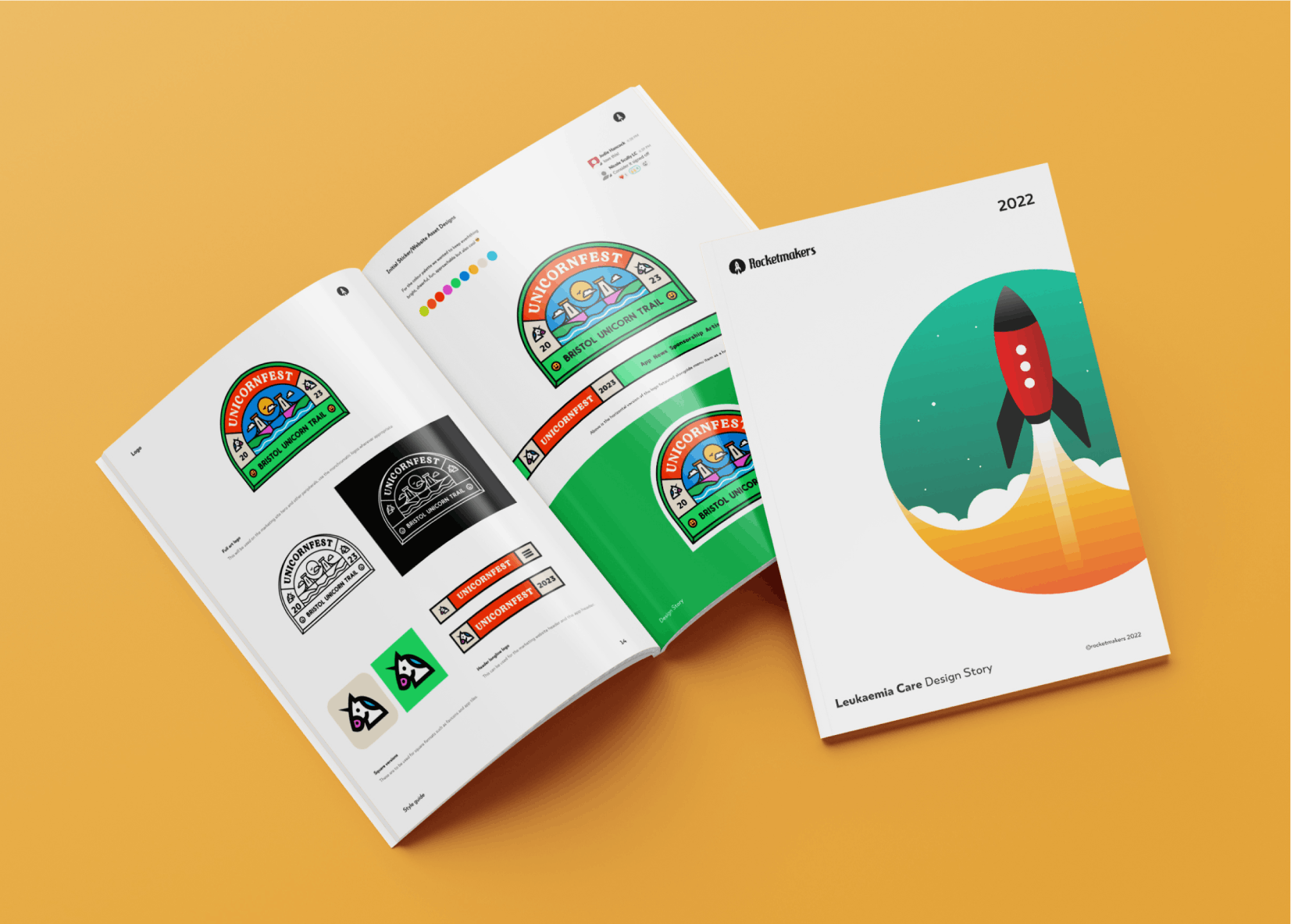
Our mission was to
- create a versatile logo and engaging brand identity
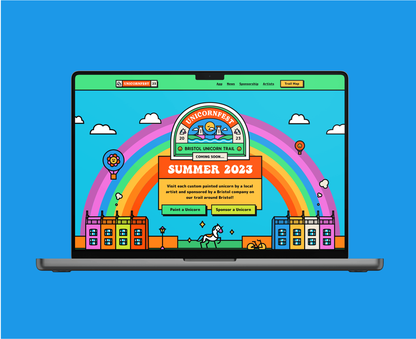
- develop a captivating marketing site
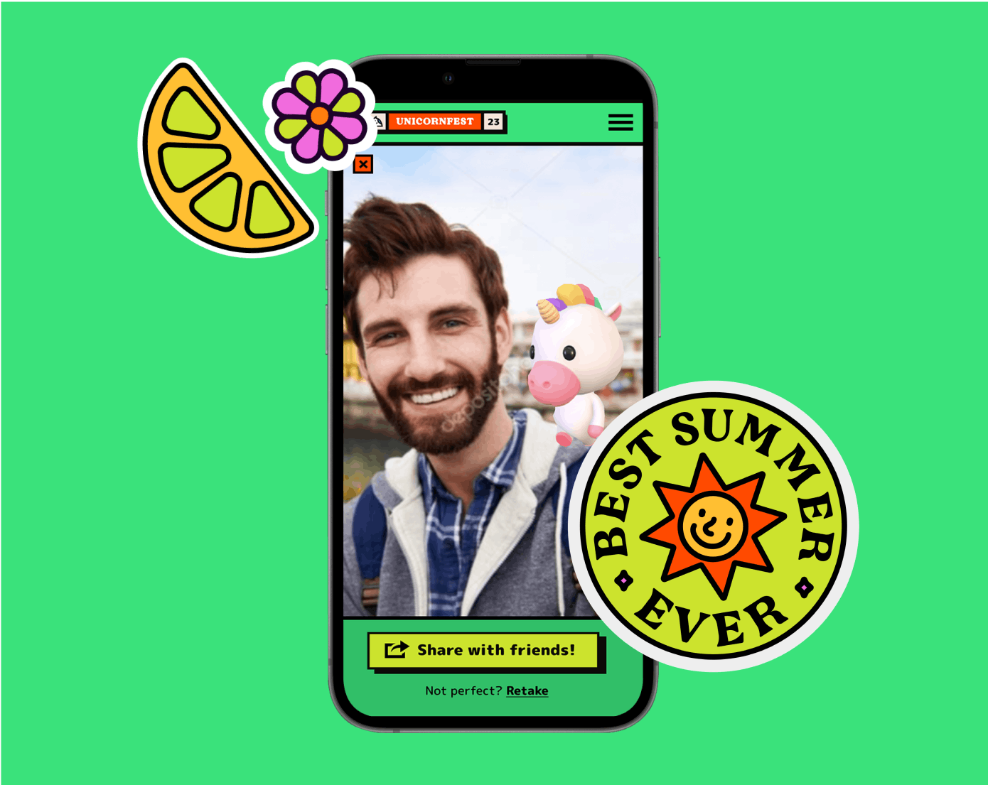
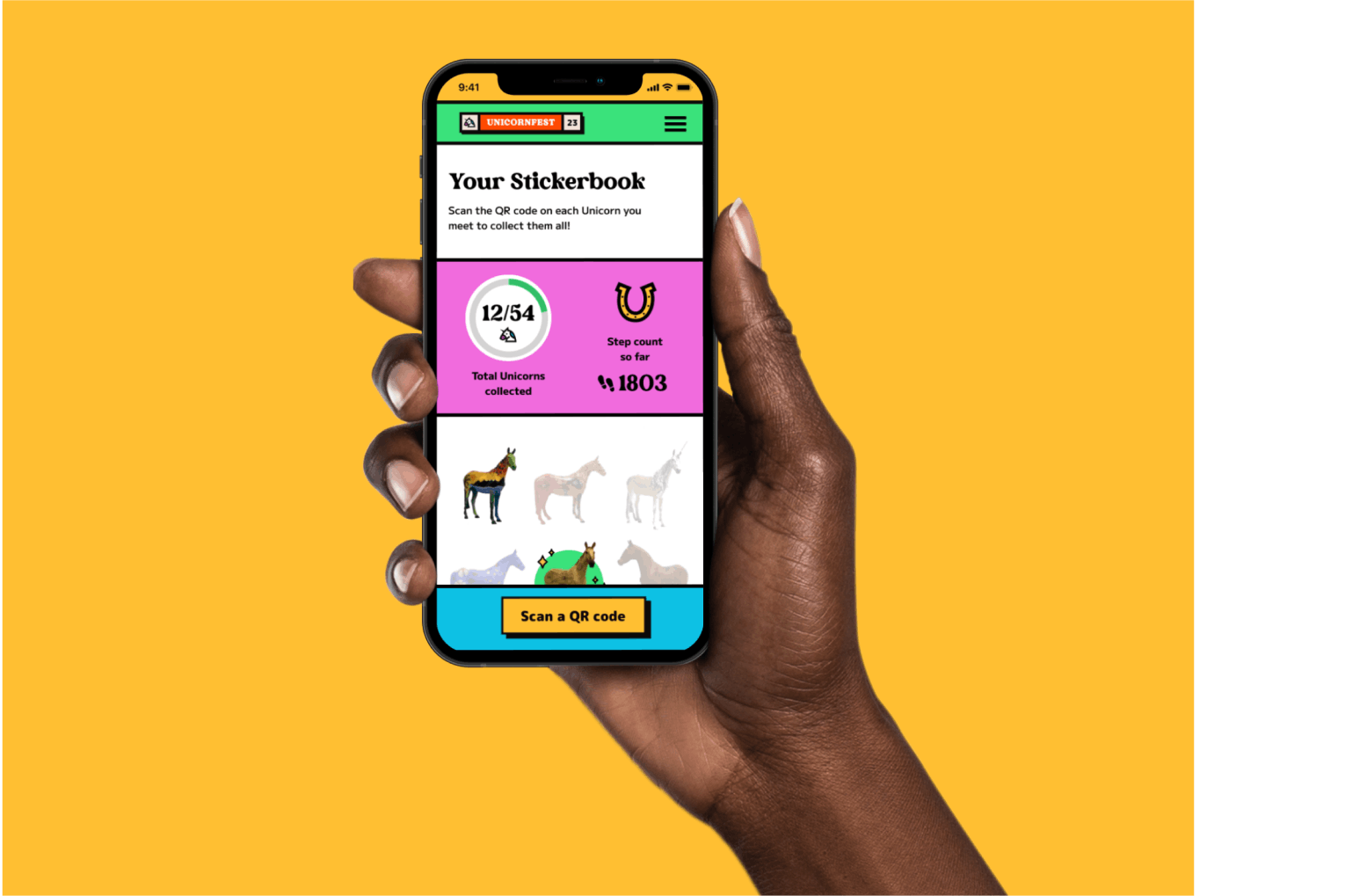
- design an interactive unicorn-collecting app.
We approached this project with huge enthusiasm and began crafting a solution that perfectly embodies the spirit of this charitable event. It was a journey of innovation and purpose-driven design.
Creating a Brand Sandwich
In our design process, we embrace a concept known as 'Creating a Brand Sandwich.' This client-led exercise helps us grasp the essence of a brand or product more effectively. Just like a sandwich has its unique filling, we explore what sets your brand apart, its distinctive qualities, and the key ingredients that make it special.
For instance, Unicornfest's brand sandwich includes words like: Bristol, Edgy, Nostalgic, Inclusive, and Energetic. This insight provided us with a clear direction while developing the visual design language for their brand.
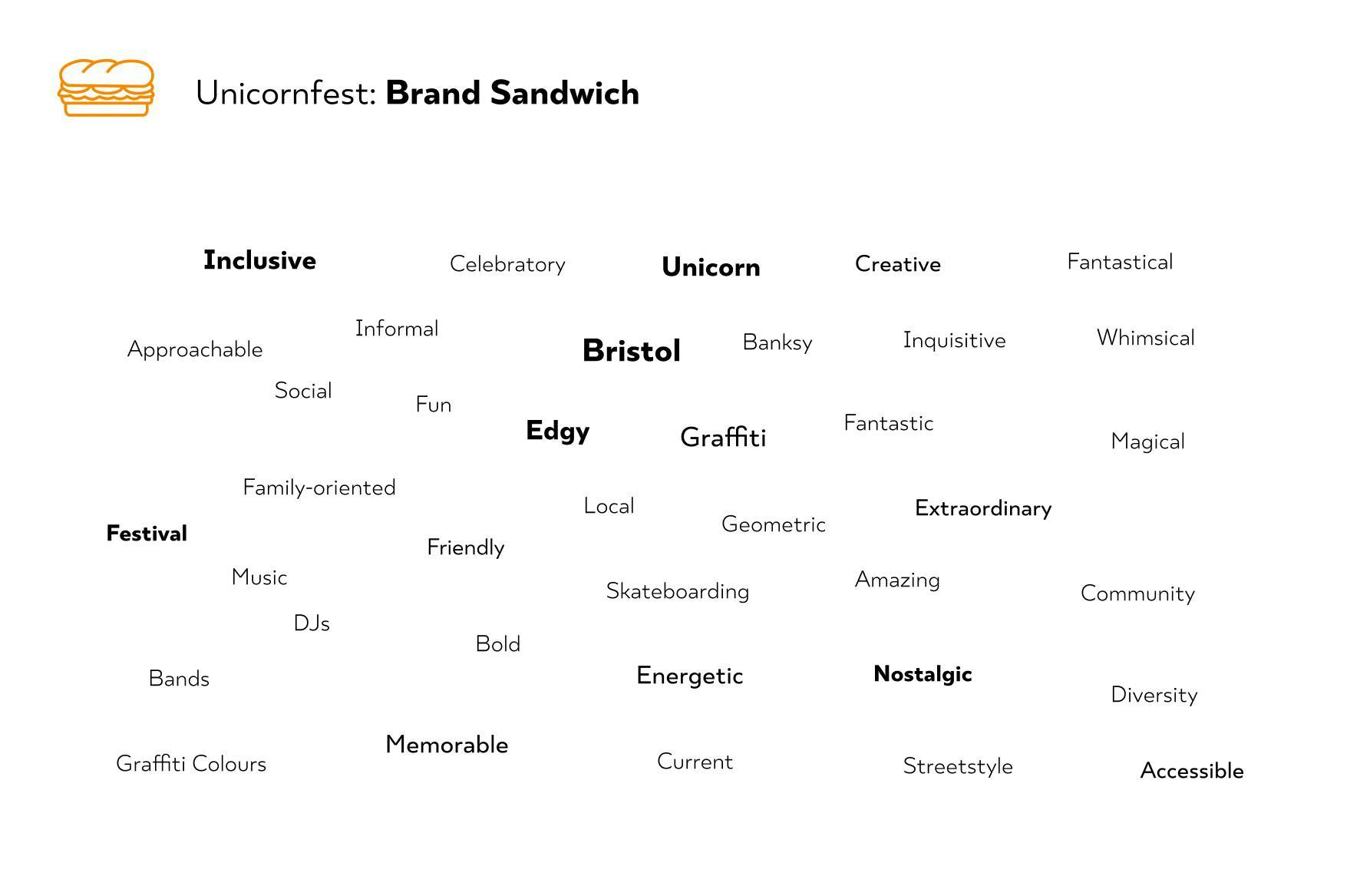
During the initial brainstorming, we also defined what elements were not part of their brand sandwich. For Unicornfest, it was crucial to avoid generic unicorns that appeal exclusively to a younger, typically feminine audience, as their event targets people of all backgrounds and ages. To ensure inclusivity, we made sure to steer clear of overly pink and traditionally “girly” styles and typical Disney-fication. Instead, we opted for a cooler, edgier, and more diverse approach. This way, Unicornfest's brand could truly resonate with a broader audience and make a memorable impact on all attendees.
Inspiration
Our design team believes in collaboration.
Gathering inspiration plays a vital role in every design process. Although some people believe that drawing inspiration from multiple graphic designers diminishes the creative value of the final outcome; We’ve found that the more diverse sources of inspiration you explore, the more creativity you infuse into the end product.
Mood boards
Our design team will use mood boards in most projects, collating inspiration on fonts, layout, and colour schemes. These boards inform our design decisions later in the process and also serve as efficient tools to present a clear vision and direction to our clients. By curating around three different mood boards, based on the concepts from the brand sandwich, we guide clients towards a shared vision, this is especially useful if they lack existing ideas for their brand.
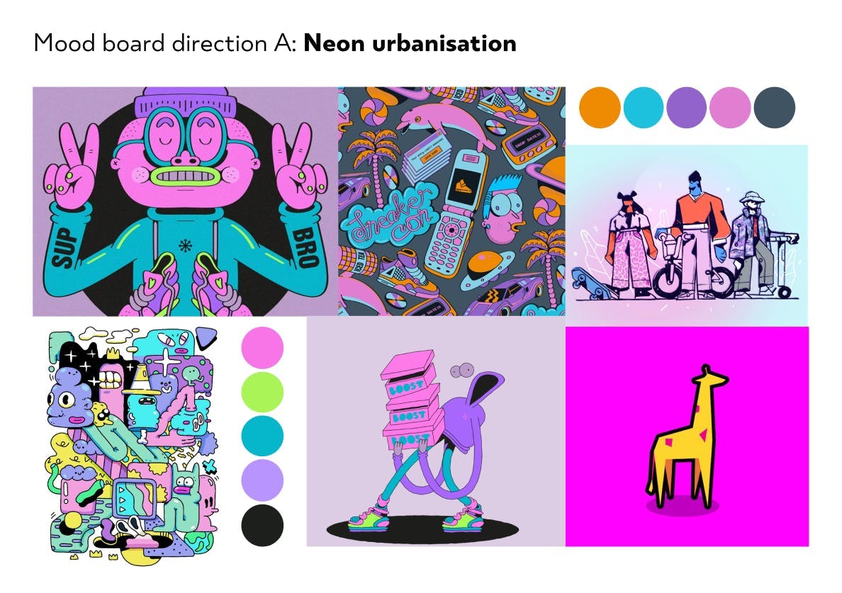
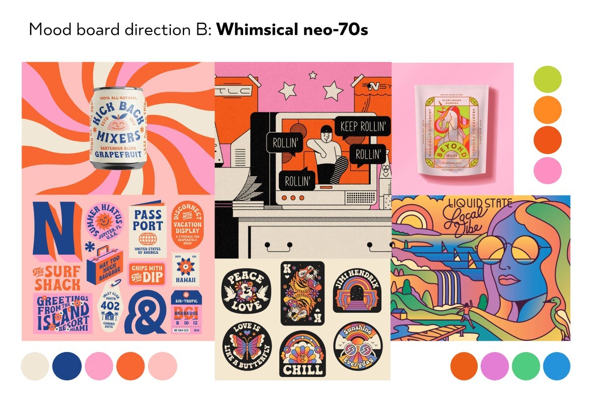
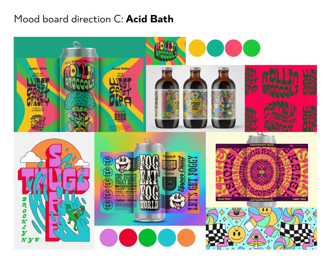
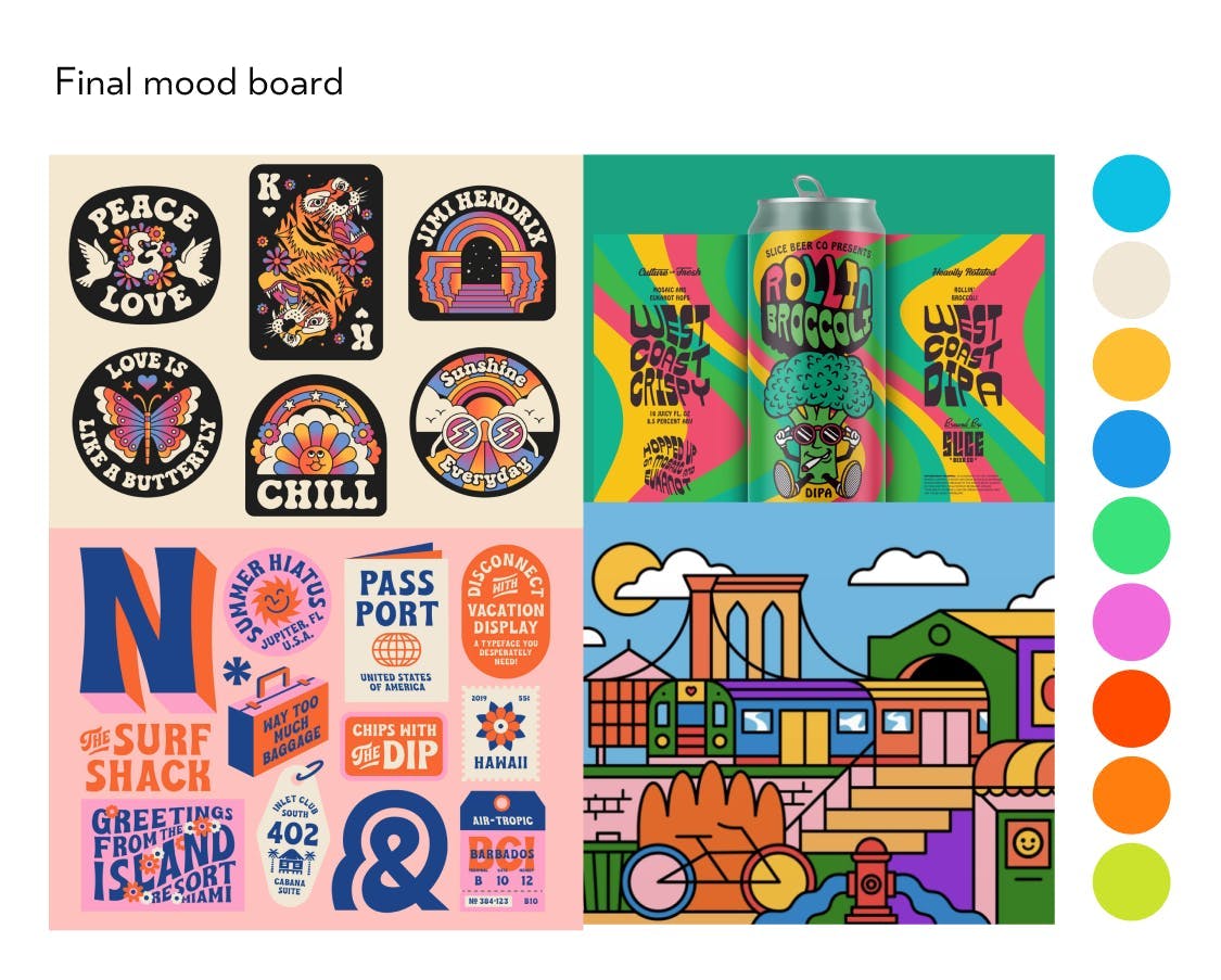
During the presentation of mood board options, we emphasise understanding both client preferences and dislikes. By considering which design styles don't align with their brand, we can swiftly craft a design that truly reflects their identity and objectives. This approach streamlines our agile design process, ensuring our efforts are focused on delivering a design that resonates with our clients' desires.
Competitors and similar applications
Another essential aspect of finding inspiration is studying competitors and similar applications or campaigns. For Unicornfest, we embarked on this journey with the client by examining various art trails across the UK. Together, we carefully analysed the branding and applications to identify successful elements and areas that needed improvement. Our focus was particularly on art trails that catered to a similar target audience, as this provided valuable insights for enhancing brand inclusivity.
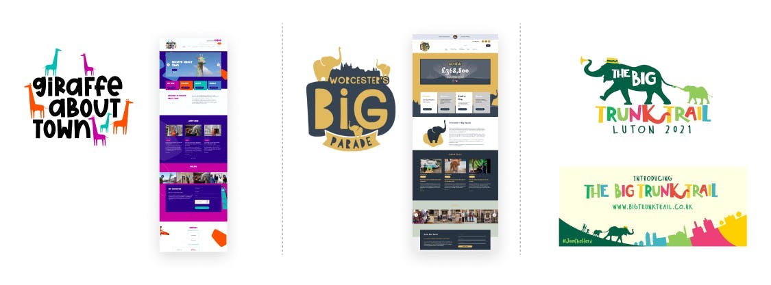
Through this exercise, we gained valuable knowledge about what to avoid in our approach and discovered positive aspects that could be incorporated into our UI design. By leveraging the experiences and lessons learned from other successful art trails, we were able to shape a more informed and impactful design strategy for Unicornfest.
Blockups
‘Blockups’ is not an industry term, it's a variation of wireframing that is unique to Rocketmakers design team. We use varying shades of grey alongside shapes and placeholder text to define the page's structure. Using grey tones helps us identify which information and actions stand out the most, this allows us to create intuitive designs and improve the users experience.
Blockups swiftly translate the client and user needs into layout designs. By eliminating visual distractions, we focus on user interaction and layout, enabling clients to concentrate on their page's narrative and streamlining content creation.
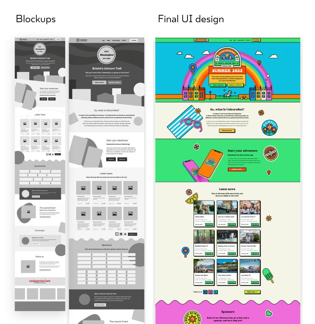
Blockups help clarify content and interaction priorities, allowing for early client feedback on the UI design draft. This agile and iterative approach optimises feedback loops from the outset, ensuring no design time is wasted. These drafts act as the starting point, incorporating placeholders for yet-to-be-created images or illustrations. Once approved, they inform asset creation, preventing unnecessary work and streamlining the entire process.
Ideation refinement
When crafting brand assets, beginning with sketches is highly beneficial as it fosters quick and unrestricted ideation. For logo development, mood-boarding remains an excellent way to find inspiration, while also helping to avoid inadvertently creating a logo that already exists.
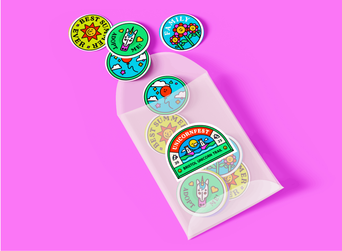
In the case of Unicornfest, we initiated the process with sketches for their brand stickers, which would be utilised across social media, marketing materials, the website, and physical merchandise. Our team explored multiple variations for each sticker, presenting the client with our top choices. Upon selecting their favourite concepts, we refined and transformed them into vector illustrations.
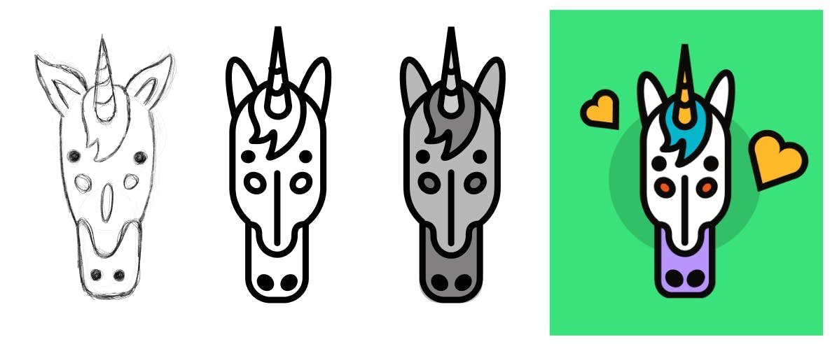
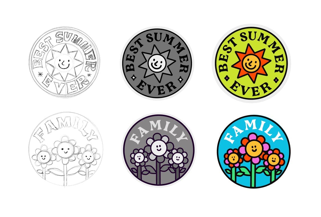
A key guideline we follow is creating all brand assets in black on white initially. This approach ensures the assets are effective, as if they work well in monochrome, they will likely be just as impactful when adding colour later on. This thoughtful approach to design ensures a strong foundation for the brand's visual identity.
Colour scheme
When it comes to colour schemes, mood boarding and gathering inspiration are essential. Regardless of the original design source content, we gather screenshots of colour combinations that align with the brand we're creating. Revisiting the Brand Sandwich serves as a valuable check for our decisions. For Unicornfest, we sought colours that exuded energy, inclusivity, and creativity. Starting with colours from our original brand direction presentations, we refined and combined them with inspiration from our collection.
Creating a couple of palettes, we then apply them to the logo and stickers. The most suitable one for the brand and its audience becomes our chosen scheme. We present this colour scheme and the coloured brand assets to the client for feedback and approval, ensuring it perfectly aligns with their vision and brand identity. This meticulous process results in a vibrant and cohesive visual representation for Unicornfest.
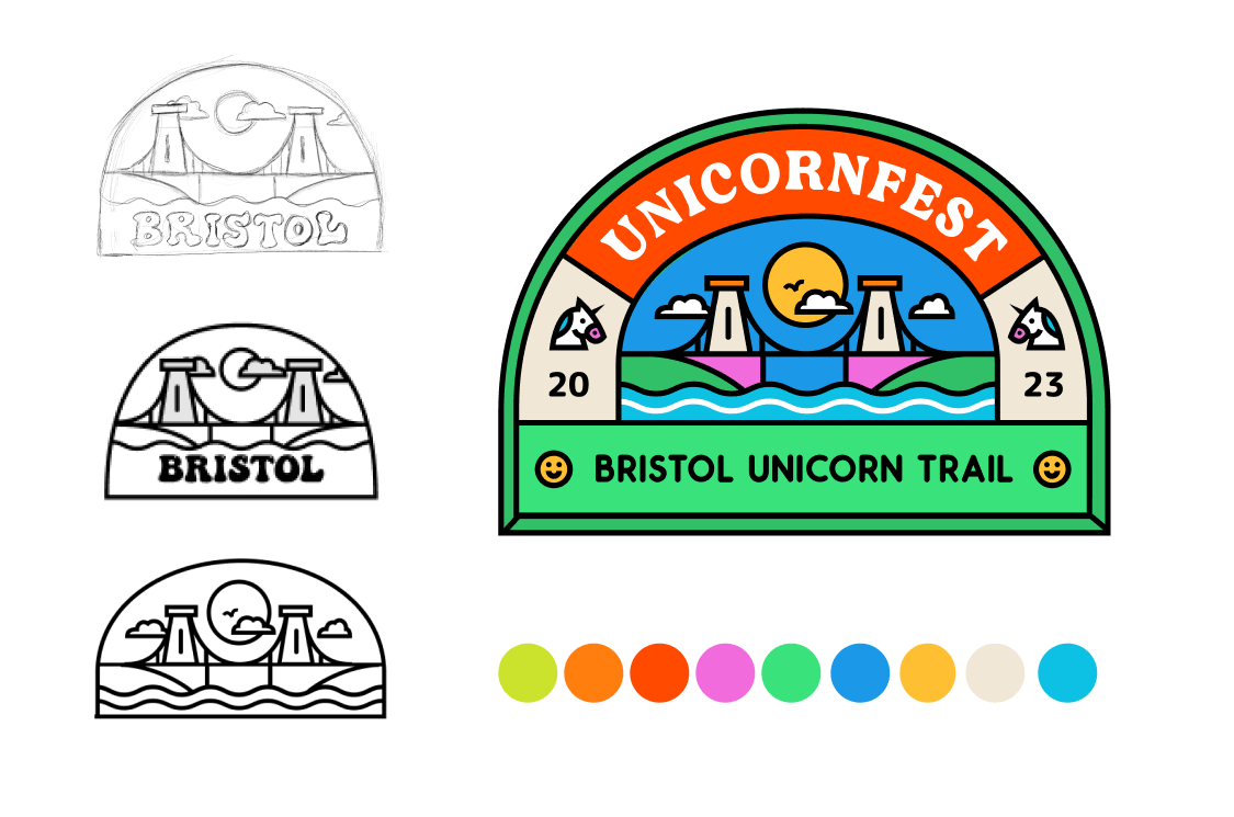
After creating all the brand elements, we compiled them into a style guide, which guided the design of the marketing site, app UI, and printed map, ensuring a consistent visual identity throughout the project.
Using mood boards, early feedback loops, and iterative approaches, we refine our designs for visually appealing and effective brand messages. By understanding clients' needs and engaging them throughout the process, we deliver inclusive and user-centric designs that stand out.
Impact
Unicornfest is now live in and around Bristol. The Unicornfest branding features on their social media, website and even on items in their merch store. The best way to experience Unicornfest is to download the app and collect the Unicorns by scanning the QR codes.
