Six Design Trends for 2024
As the Creative Lead here at Rocketmakers, I'm always on the lookout for new trends that inspire creativity. I have compiled a list of design trends that are particularly effective and potentially influential in the digital design landscape of the new year. Here are 6 of my favourite trends that are gaining popularity as we kick off 2024.
3D Rebranding
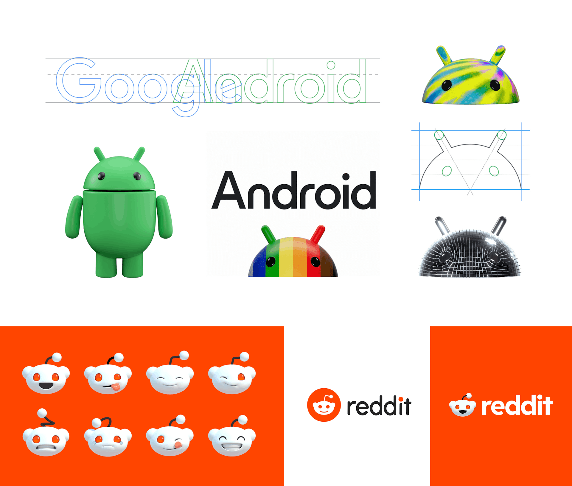
A trend that is growing in popularity in 2024 is 3D rebranding. In an era where 3D avatars, animations, and immersive experiences take centre stage, brand design is expected to follow suit. With Virtual Reality (VR) and Augmented Reality (AR) integrating into our daily routines, the conventional constraints associated with brand design for print are gradually diminishing. This will encourage the exploration of 3D logo marks, providing brands with a dynamic platform that extends beyond the limitations of traditional 2D design.
In recent years, there has been a prevailing trend toward oversimplified branding, epitomised by the widespread adoption of minimal, flat logo designs, commonly referred to as 'blanding.' However, many household names that embraced this trend discovered that in their pursuit of a clean and modern aesthetic, they sacrificed the distinctive personality that defines their brand. The rise of 3D rebranding represents a departure from this trend, offering brands an opportunity to reclaim their individuality while still embracing a sleek and contemporary visual appeal.
Reddit recently embraced a 3D redesign, introducing a dynamic avatar and animated logo to its interface. This departure from static logos adds a modern and engaging dimension to the platform, the redesign is in keeping with the informal community aspect of their brand. The incorporation of 3D elements, primarily focussed on animation for use in social media and video marketing, reflects a move toward a more visually compelling and interactive online environment.
Authenticity and Imperfectionism
In 2024 we can expect to see a shift towards authenticity and imperfectionism, and it feels like a collective response to the AI overload we've been experiencing. The constant presence of AI in everything we do can be a bit overwhelming. It's not just about having AI everywhere; it's also about the idea that AI is a one-size-fits-all solution, somewhat overshadowing the human elements like empathy, creativity, and understanding. Undeniably, AI is now a part of the scene, but our perspective on it is evolving.
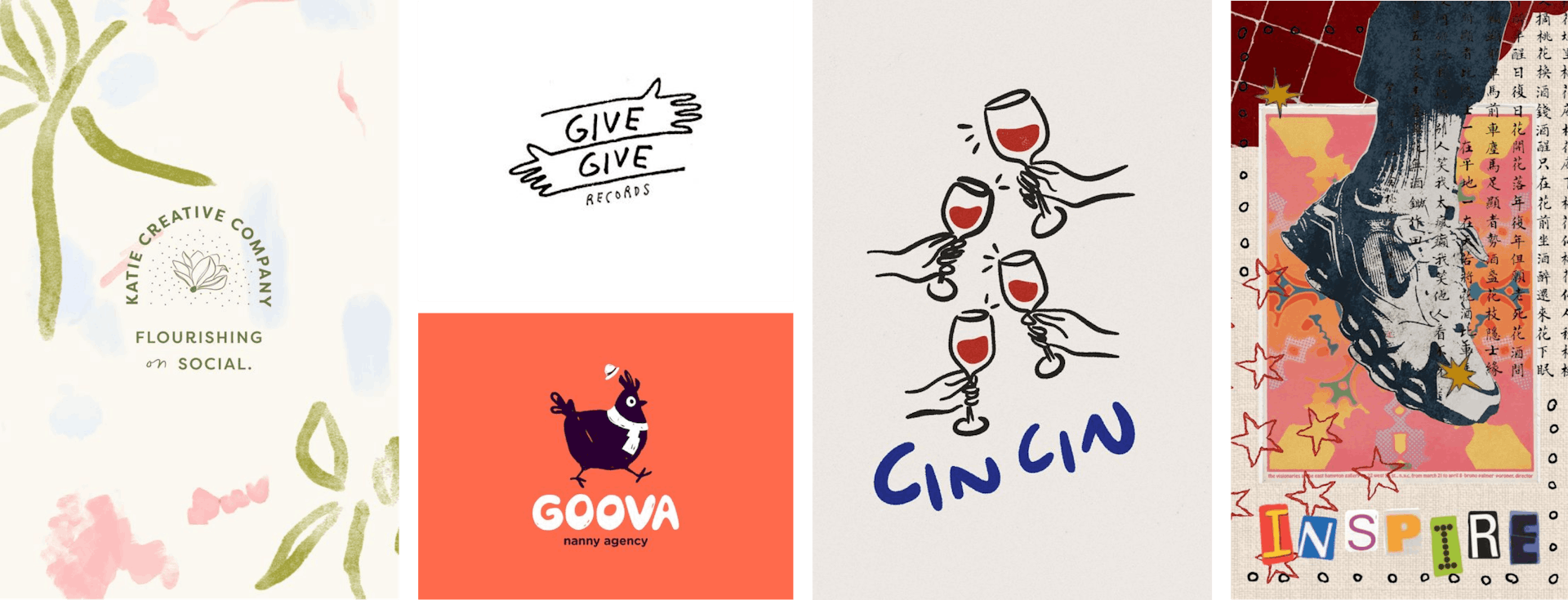
As the appreciation for humanised design gains traction, designs with that handcrafted quality will be more wide-spread. People are drawn to the imperfect charm of designs that aren't overly perfect and generated by some machine.
Authenticity in design can be seen in custom hand-drawn fonts and branding that blends real art techniques with digital design – like scanning images, adding watercolour textures, and creating photography collages. This trend is based on reintroducing that human touch to design. In 2024 it’s all about authenticity and steering away from the super sleek look of AI-generated perfection.
AI Generated Imagery
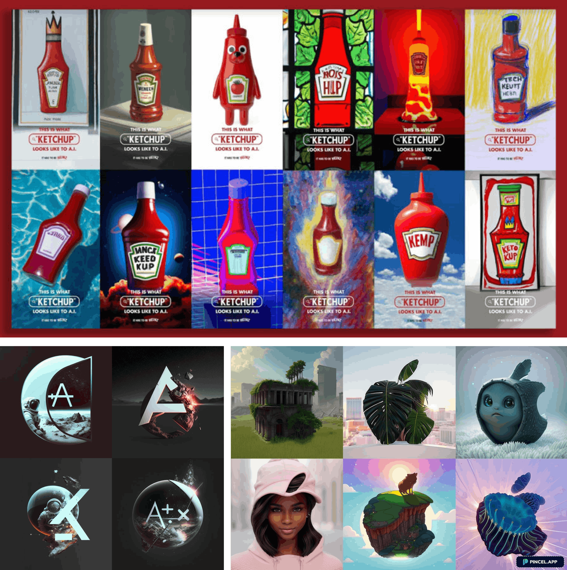
We have all seen the increase in AI-generated imagery recently; we are collectively experimenting with AI tools and learning about its capabilities and downfalls. It is no surprise that some brands have embraced the journey too. The ease of content creation that AI tools offer is seen as beneficial to companies wanting to save time or invoke conversation.
Despite the growing potential of AI generated imagery, there are notable downsides, including concerns about creativity, homogeneity and ethical considerations regarding bias. However, the continuous improvement of AI technology suggests its inevitable integration into designers' workflows. AI tools prove particularly useful for inspiration gathering and quick prototyping, streamlining certain aspects of the creative process.
While discussions arise about the potential for AI to handle entire design tasks, the consensus remains that AI will never fully replace the human aspect of design. Design is an inherently human and subjective endeavour, involving nuances and emotions that AI struggles to emulate. The future likely holds a collaborative relationship between AI and designers, where each contributes its strengths to create a speedier workflow and hopefully a more enriched creative landscape.
Glassmorphism
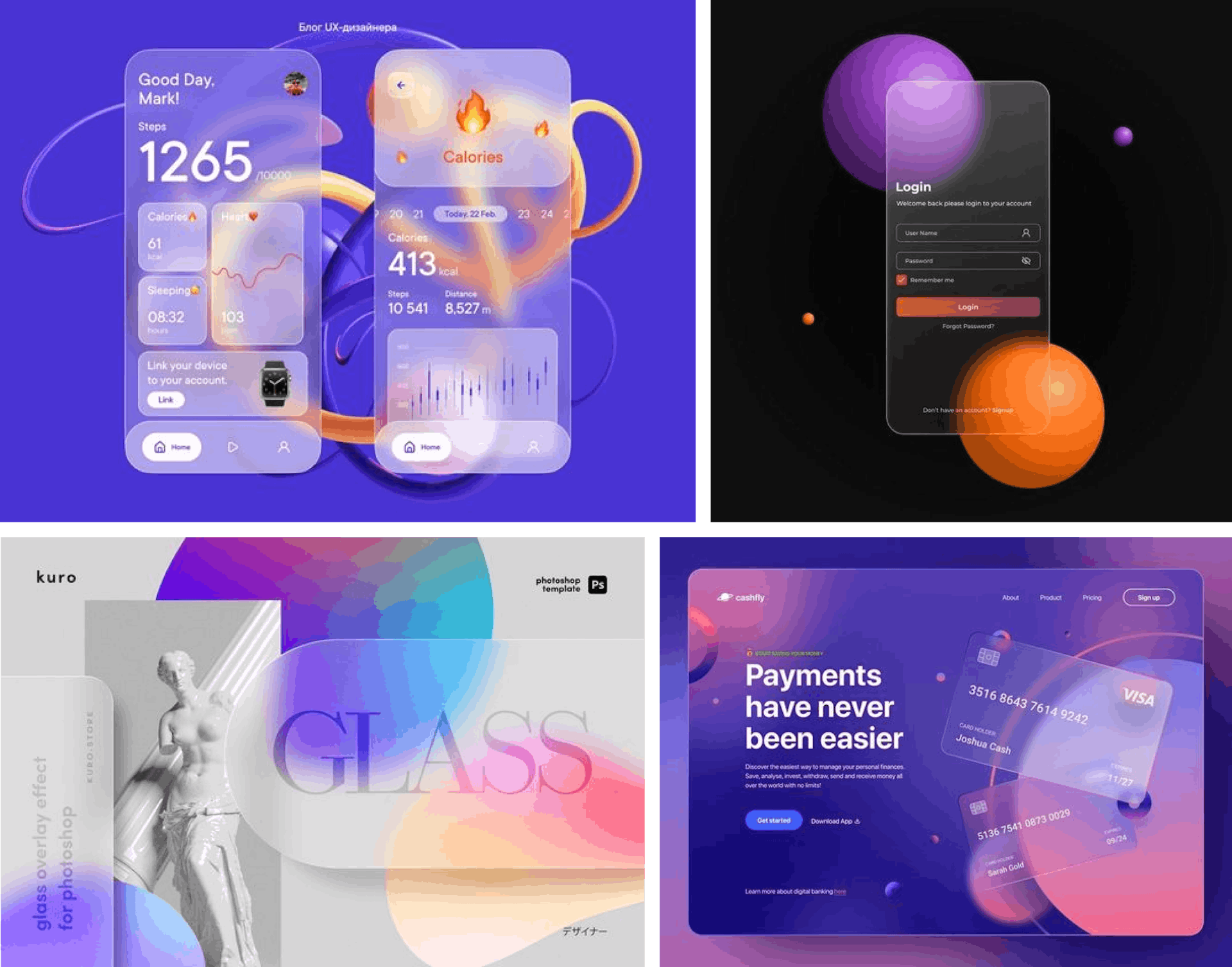
Glassmorphism is a modern design trend that finds its origins in the realism attempts of skeuomorphism in the 90s. Skeuomorphism gained prominence through early Apple interfaces but has gradually faded from the design spotlight in recent years. This trend has resurfaced in a refined, understated form—a new spin that offers a subtle yet expensive aesthetic, seamlessly blending elements of the retro trend with contemporary design sensibilities.
This design aesthetic involves creating a glass-like, translucent effect, presenting an interesting challenge for designers. The success of this design style relies on the transparency of the frosted glass elements being realistic, and the contrast of the backgrounds to be flawless.
Offering a sophisticated three-dimensional quality by mimicking real glass, Glassmorphism breathes life into digital interfaces. This trend creates a modern visual experience through a harmonious blend of light, shadow, and transparency illusion, contributing to a sense of space. This trend offers brands the opportunity to break away from flat design norms and explore new dimensions. We are most likely to see this design tactic used by brands looking to highlight their clean, modern and polished aesthetic.
Bento box layouts
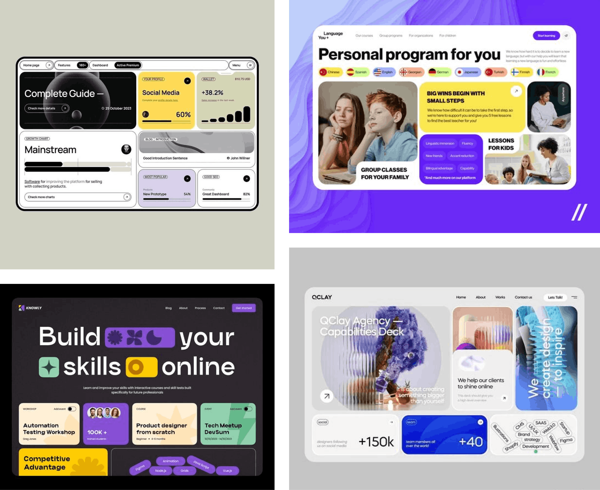
The concept of sectioning and organising content into boxes has been a staple in UI design for years. However, the current trend sees a sleek and modern twist with the popularity of Bento Box layouts - a name inspired by the Japanese lunch boxes featuring many small compartments with curved edges that all fit seamlessly together. This design approach not only adds a touch of sophistication but also introduces a dynamic visual element to user interfaces.
Bento box layouts are growing in popularity as they offer users multiple options for interaction within one easy to access area, this aligns with the growing competency of users - as they collectively become familiar with technology users don’t need the same level of guidance through applications. An application having all the options readily available is no longer seen as overwhelming in this age of technologically confident users.
Notably, this trend has transcended traditional UI platforms and has found its way into XR interaction designs. Bento box layouts can be seen in the interactive menus within the realm of virtual reality (VR), as an immersive experience relies on space planning for navigation having all the options readily available is hugely beneficial. The integration of these curved edge boxes showcases a contemporary approach to organising and presenting content, enhancing the user experience across various digital environments.
Shape-shifting logos
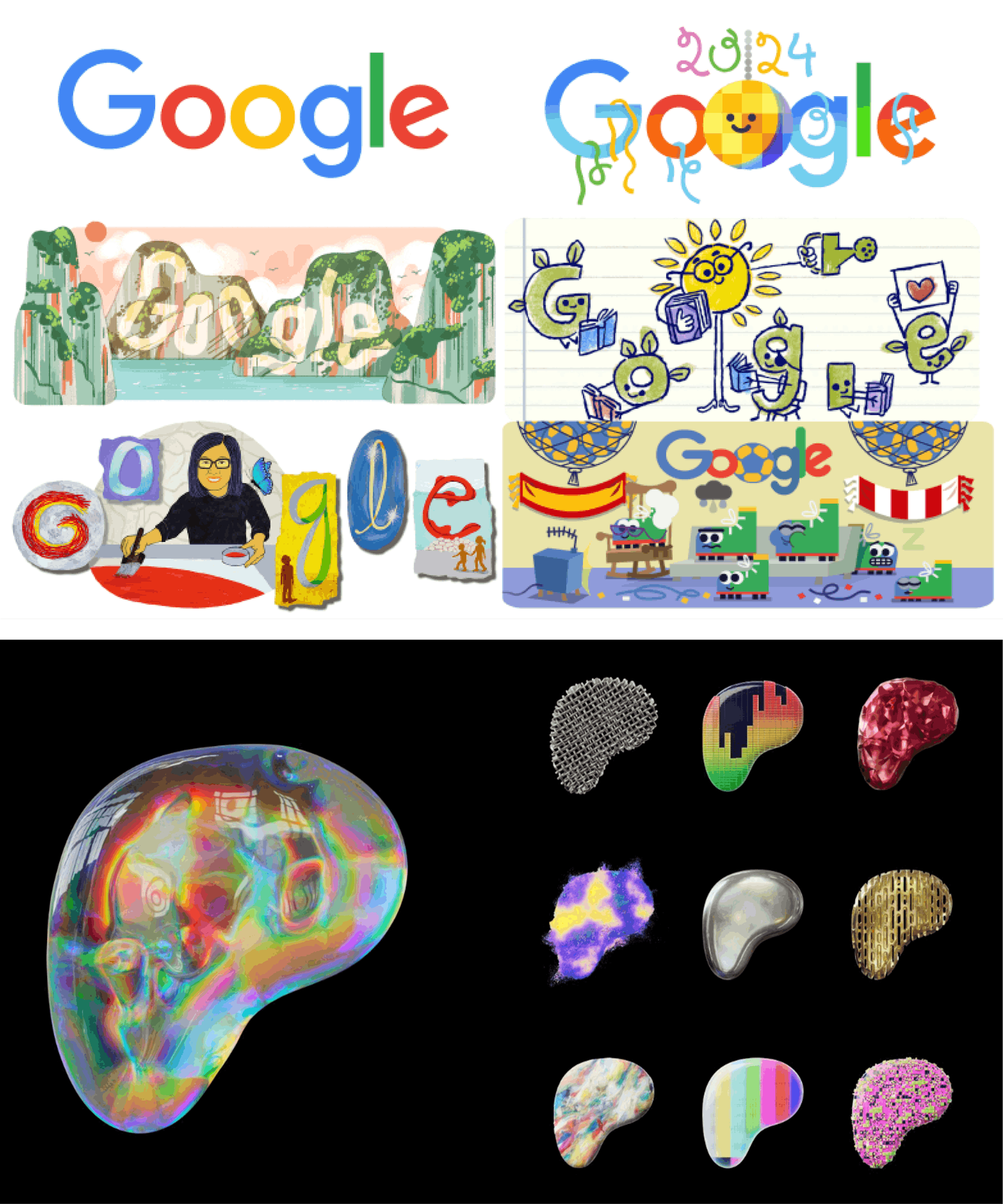
Another shift in logo design introduces shape-shifting logo-marks that fluidly transform, showcasing a range of themes within one brand. These logos, adopts multiple visual identities, and caters to the ever-changing nature of digital branding. As modern brands extend beyond products into community and lifestyles, the flexibility of shape-shifting logos allows brands to communicate versatility and adaptability in the visual representation of their identity.
This branding approach relies on established brand recognition, making it particularly effective for 'everyday' brands. Google has been employing shape-shifting logos for years now - a strategy that vividly captures the expansive scope of Google's international community. By introducing new and informative content daily, Google's dynamic logos transcend the limitations of a static emblem, enabling the brand language to evolve and consistently captivate user interest. This dynamic adaptation not only reinforces brand identity but also ensures an ongoing and engaging connection with its audience.
Patreon's recent redesign is a more recent example of this shape-shifting logo trend. The updated logo has a contemporary and multimedia feel, encapsulating the diverse elements that define the company. With sleek design elements and a modern aesthetic, Patreon's new look aligns with current design trends while ensuring a cohesive representation of its multifaceted brand identity. The redesign not only serves as a visual refresh but also underscores Patreon's adaptability and forward-thinking approach in the evolving landscape of digital platforms.
Thank you for exploring these upcoming design trends with me. If any of these trends resonate with your project vision or if you're considering expert assistance to bring your ideas to fruition, consider reaching out to Rocketmakers. We're here to navigate the creative journey with you.
